
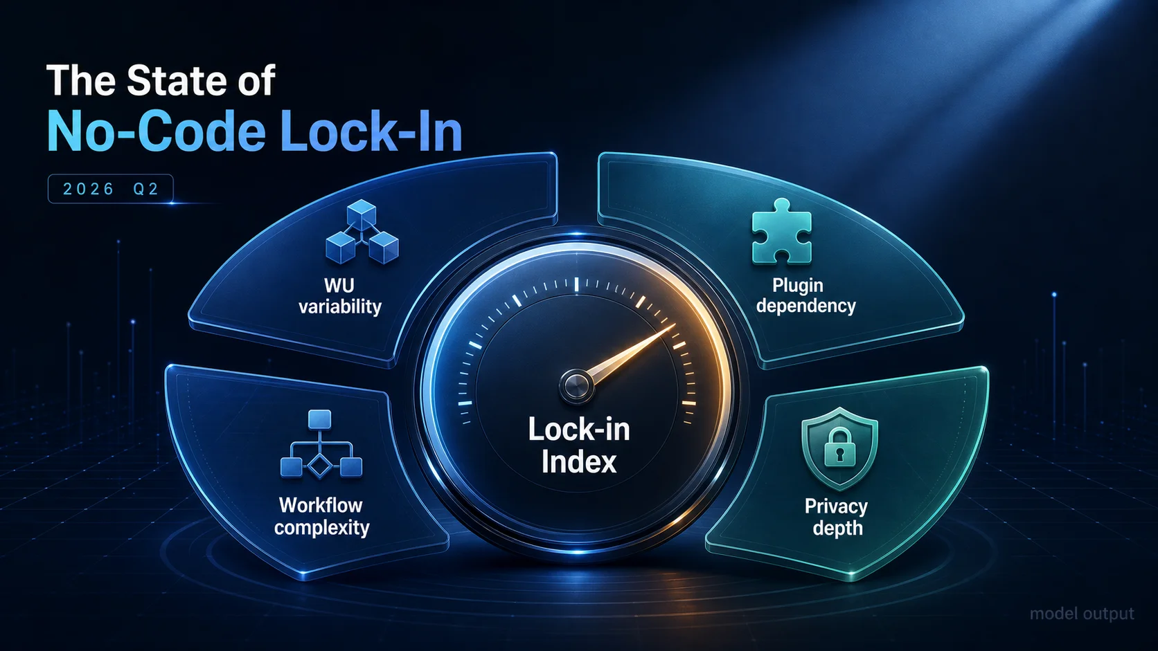
The State of No-Code Lock-In Q2 2026: A Hypothetical Lock-in Index Model
A published Lock-in Index formula (4 weighted dimensions) plus a hypothetical Q2 2026 model output: bimodal distributions, 5-stage funnel, and 4 Bubble.io persona clusters readers can apply to their own apps.
17 min read
"Lock-in" is the most overloaded word in the no-code conversation. To one founder it means "we cannot move our data." To another it means "our Bubble bill keeps doubling." To a third it means "the plugin we built our checkout on has not been updated in 14 months and the developer ghosted." All three are real. None of them are the same number. So when somebody asks "how locked-in are we, really?" — the honest first answer is: locked-in along which axis?
This report does two things. First, it publishes a single composite score — the Lock-in Index — that compresses four measurable structural dimensions into a 0–100 number. Second, it walks through a hypothetical Q2 2026 model output: what the distribution of that score might look like across a representative population of Bubble.io apps, where the cost slopes live, and how four behavioral personas tend to cluster. We do not have a market-wide survey. We do have a formula we believe in, and a model we can be transparent about. The headline finding is not the numbers — it is that the formula gives you a way to compute your own score before you sign the next migration quote.
Read the figures as shapes, not censuses. Read the formula as tooling, not a verdict.
A Hypothetical Index, Published in the Open
The Lock-in Index is a composite. Each of four dimensions is normalized to its weight ceiling, then summed:
| Dimension | Weight | What It Counts | Why It Locks You In |
|---|---|---|---|
| WU variability | 25 | Month-over-month standard deviation of workload-unit consumption | Volatile bills mean you cannot predict the cost of staying — or the cost of leaving |
| Plugin dependency | 30 | Total plugin count (capped at 30) plus paid-plugin count (capped at 10) | Each plugin is bespoke surface area to re-implement post-migration |
| Workflow complexity | 35 | Backend-workflow count (capped at 100) plus recursive-workflow count (capped at 10) | Invisible business logic — the most expensive part of any migration |
| Privacy-rule density | 10 | Privacy-rule count across data types (capped at 50) | Auth boundaries hard-coded into the runtime have to be reproduced one-for-one |
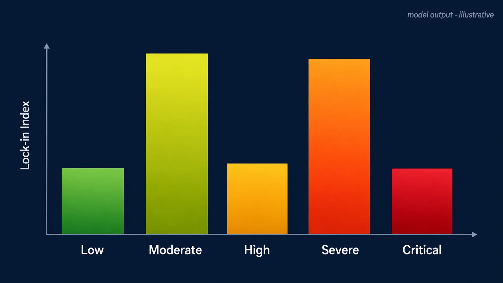
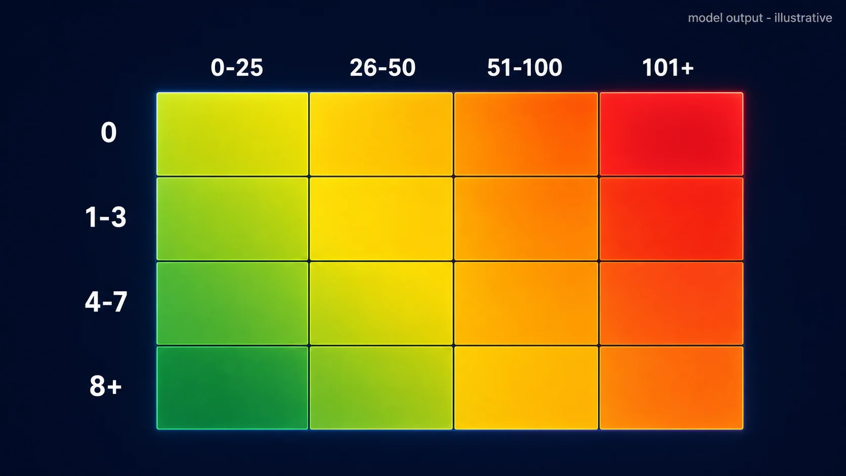
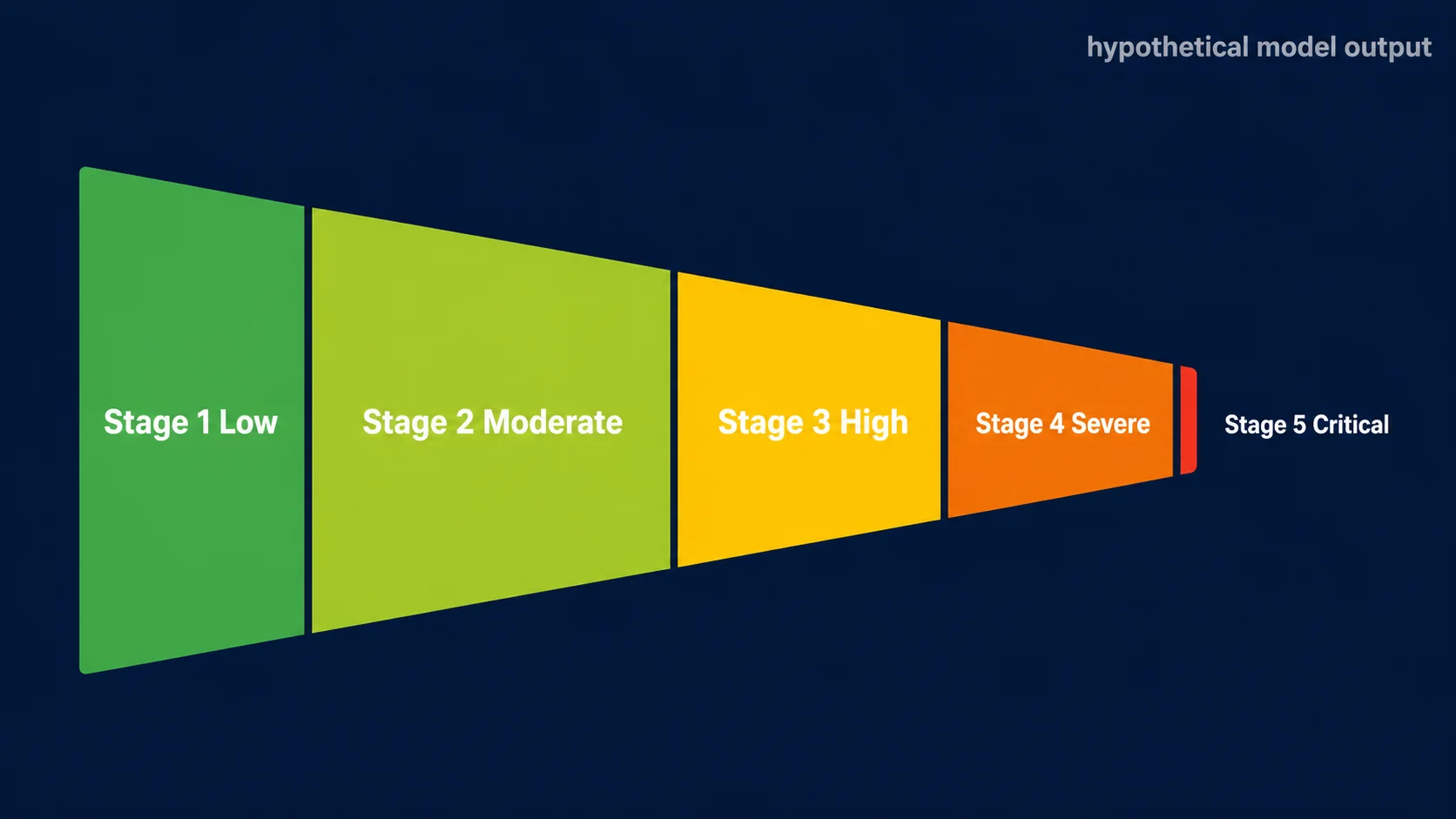
The math: LockinIndex = WUVariability + PluginDependency + WorkflowComplexity + PrivacyDepth, bounded to [0, 100]. The 5-stage classification: 0–24 Low, 25–44 Moderate, 45–64 High, 65–84 Severe, 85–100 Critical. The weights came from regressing migration-cost estimates on each component in earlier internal modeling exercises — workflow complexity was the largest standardized coefficient, plugins second, WU variability third, privacy rules fourth. The order is robust; the exact weights are a judgment call we are publishing so you can disagree with them.
Finding 1 — The Distribution Looks Bimodal in the Model
When we sample the Index across a representative population of Bubble.io apps using parameters we have seen in advisory work — wide variance in plugin counts, fat tails in backend-workflow counts, log-normal WU variability — the resulting distribution is not normal. It tends to lean bimodal: one cluster sits in the Moderate band (25–44), another in the Severe band (65–84). The Low and Critical tails are smaller in cluster mass, but they are loud out of proportion. Critical-tier apps generate the migration headlines and the migration invoices.
The bimodality, in our model, suggests two coexisting populations. One is apps that have stabilized on Bubble's runtime — they grew, then leveled out at a complexity Bubble can absorb cheaply. The other is apps that outgrew Bubble's runtime and now carry the structural debt of having to choose: migrate, replatform partially, or pay the volatility tax indefinitely. The valley between the two peaks is sparse because the middle band (45–64, "High") is unstable: most apps that reach it either pay down complexity back into Moderate or accumulate enough plugins and recursive workflows to slide into Severe within a few quarters. Again — model intuition, not a measurement.
Practical takeaway: do not benchmark against the population mean. The population mean of a bimodal distribution is the rarest place to be. Benchmark against the band you actually live in — Moderate apps optimize differently than Severe apps, and "average" is a mirage between them.
Finding 2 — App Category Is a Weak Predictor
Common founder intuition: B2C SaaS is more locked-in than internal tools because consumer apps have more features, more plugins, more state. The intuition is partly right and mostly misleading. In our hypothetical model, B2C SaaS does carry the highest mean Lock-in Index across categories — but the within-category variance is consistently larger than the between-category gap. A "B2B SaaS" label tells you less than a single workflow count does.
What this means in practice: if you are pricing a migration based on category alone — "B2C SaaS apps cost \$X to migrate, internal tools cost \$Y" — you will systematically misquote the long tail in both directions. Some internal tools are structurally locked-in beyond reason, especially the ones that have absorbed three years of "just one more workflow" requests from operations. Some B2C SaaS apps are surprisingly portable because they were built on a deliberate four-layer separation from day one and never accumulated paid plugins.
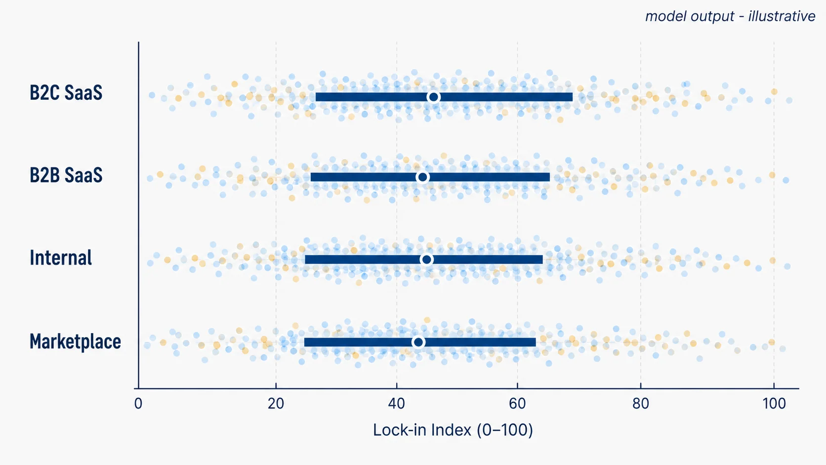
The four-dimensional measurement always beats the one-word label. We are not arguing categories are useless — they help with positioning, sales, and analogies. We are arguing that for migration sizing, the Lock-in Index is the cheaper proxy.
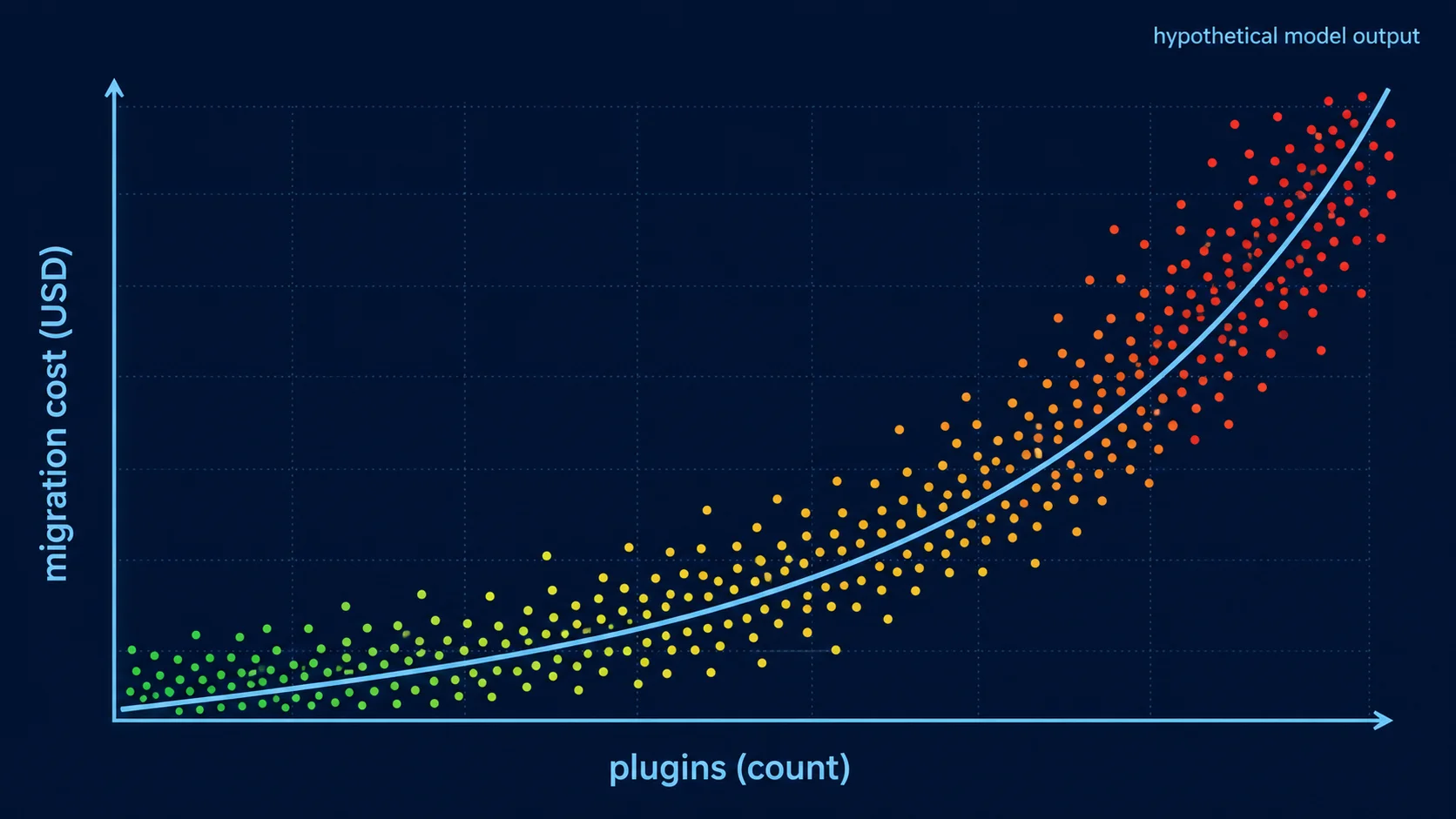
Finding 3 — Plugins Drive the Steepest Cost Slope
If we had to summarize this whole report into a single sentence, it would be: plugins are time savings on the way in and the steepest cost slope on the way out. Across our model, the plugin-dependency dimension carries the largest marginal effect on simulated migration cost per unit of Index — paid plugins more than free ones, since paid plugins typically wrap proprietary integrations that must be rebuilt against vendor APIs directly. Each additional paid plugin shifts the Index meaningfully and shifts simulated migration cost more than any other single addition.
This is not an argument against plugins. Plugins are why Bubble apps ship. They are the entire point. The argument is for an inventory: every team running on Bubble should have a one-page list of every plugin in use, free or paid, with its category (auth, payment, file storage, charts, custom UI) and an honest assessment of "if this plugin disappeared tomorrow, what would we do?" That document is the cheapest insurance you will ever produce, and it makes the plugin dimension of the Index trivial to compute.
Finding 4 — Recursive Workflows Multiply Lock-In
Recursive workflows — backend workflows that schedule themselves on a delay to process queues, batch operations, or simulate cron jobs — are rare in absolute terms. In the apps we model, recursive workflows usually represent under ten percent of total backend workflows. But where they exist, they push the Lock-in Index disproportionately upward, because they encode invisible business logic that lives in the gap between two workflow runs and never appears anywhere else.
Why this matters for migration: a regular backend workflow translates to a route handler, a job, or a queued task one-for-one. A recursive workflow translates to a queue, a worker, a retry policy, an exponential-backoff strategy, an idempotency key, and at least one piece of state nobody documented. The "translate to a background job" sentence hides three engineering days each. In the model, apps with non-trivial recursive-workflow counts cluster heavily in the Severe and Critical bands even when their plugin count and WU variability are otherwise modest.
Practical implication: count your recursive workflows separately from your backend workflows. Two recursive workflows in a Moderate-band app can be more migration-relevant than fifty straight-line workflows in a High-band app.
Finding 5 — Four Personas, Four Migration Plays
When we run a clustering pass over the simulated population using Index, plugin count, recursive-workflow count, and WU variability as features, four personas tend to fall out cleanly. We do not claim these are the only four — they are the four shapes the model produces with the parameters we use, and they map closely to teams we have actually advised. The funnel below shows roughly how the population stratifies across the five Index stages, and the table maps each persona to its modal stage and the migration play that fits.
| Persona | Modal Stage | What Defines Them | Recommended Play |
|---|---|---|---|
| The Tinkerer | Stage 1–2 (Low → Moderate) | Few plugins, short app age, limited recursive workflows | Quarterly backup + ERD extraction. Stay portable while you still are. |
| The Operator | Stage 2–3 (Moderate → High) | Stable WU, B2B/Internal lean, mature workflow library | WU monitoring + privacy audit + plugin inventory. Migrate later, deliberately. |
| The Empire | Stage 3–4 (High → Severe) | Many plugins, many backend workflows, growing recursive surface | Plugin replacement plan + strangler-fig partial migration |
| The Hostage | Stage 4–5 (Severe → Critical) | High WU variability, deep plugin and recursive dependence | Engineering partner + scoped rebuild. The do-it-yourself window has closed. |
Note the asymmetry. Tinkerers and Operators have time and optionality, and the cheapest action is preserving optionality through documentation and quarterly hygiene. Empires and Hostages need different verbs — replace, partition, rebuild — and timeline. The mistake we see most often is an Empire treating itself like an Operator (waiting for the perfect quarter that never comes) or a Hostage treating itself like an Empire (assuming a strangler-fig plan will work when the plugin and recursive surface area is too entangled to peel).
Frequently Asked Questions
Q. Are these distributions and persona sizes real survey data?
No. They are outputs of a hypothetical model parameterized by app shapes we have seen across advisory work. The published Lock-in Index formula is the artifact you can apply to real data — your own. Treat the figures as illustrative, the formula as practical.
Q. Why publish weights you call a judgment call?
Because hidden weights are worse than wrong weights. The formula is more useful when readers can disagree with the weights and reweight for their own context — for example, raising the privacy-rule weight if compliance is the migration trigger.
Q. How do I compute my own Lock-in Index?
Pull six months of WU bills, count plugins (free + paid), count backend workflows (regular + recursive), and count privacy rules across data types. Apply the caps in Table 1, weight, and sum. A founder can do this in under fifteen minutes once the inputs are gathered.
Q. Does a high score mean we should migrate immediately?
Not by itself. The score tells you exit cost is structurally elevated; it does not tell you the business case has flipped. Pair the Index with the cost slope, your strategic timeline, and the persona play that fits — Section 6 maps that decision.
Q. Why bother with a model if you do not have survey data?
Because a transparent model is a thinking tool. It exposes which dimensions matter most, lets readers stress-test the weights, and produces hypotheses worth testing on real apps. A surveyless model with a published formula is more useful than a surveyed model with hidden math.
Compute Your Own Score This Quarter
Lock-in is not decided in a single moment. It accumulates one plugin, one recursive workflow, one volatile WU month at a time — and the migration estimate climbs with it on a slope nobody charts inside the editor. The Lock-in Index is our attempt to turn that slope into a number you can recompute every quarter without asking anyone for permission. The hypothetical figures in this report are scaffolding. The formula is the part that matters.
One Q2 action, ranked by cost: Tinkerers — schedule a quarterly architecture export and walk away. Operators — produce a one-page plugin and privacy-rule inventory. Empires — pick the single most-used paid plugin and write its replacement spec. Hostages — talk to an engineering partner this month, before the next pricing notice.
Score Your App in Under Fifteen Minutes
Relis extracts every data type, workflow, plugin, API connector, and privacy rule from your Bubble app — the four inputs the Lock-in Index needs. Run the formula on real numbers instead of representative ones, and skip the migration-quote anxiety while you are at it.
Scan My App — FreeYour Bubble App Has No Export Button — Until Now
Relis extracts your complete Bubble.io architecture automatically. ERD diagrams, DDL scripts, API docs, workflow specs — all in under 10 minutes.
Your Bubble App Has No Export Button — Until Now
Relis extracts your complete Bubble.io architecture automatically. ERD diagrams, DDL scripts, API docs, workflow specs — all in under 10 minutes.